In this blog, I summarized some feedbacks about my website that I got during the process of communicating with my classmates.

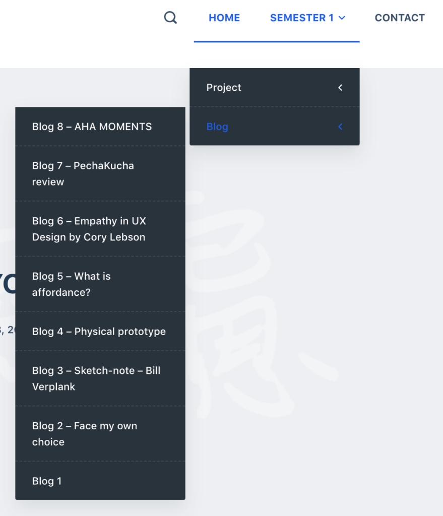
- Navigation
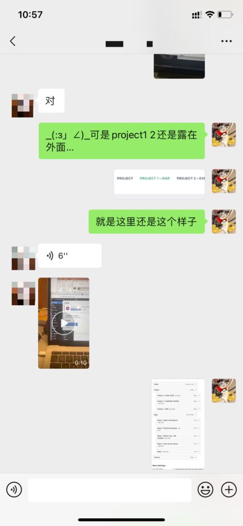
– The classification by project and blog seems unclear. The content of the first semester and the second semester is easy to confuse.
– It should be classified by semester. - Content
– The arrangement of content can be more clearly distinguished
– Each stage can be divided more clearly - Findability
– The name is relatively clear.
– However, due to the problem of navigation settings, the label part is not clear
– And the general content of the item cannot be quickly perceived when searching. - User experience
– The overall design is very clear.
– Light-colored environments can set off the content of the project, and they are more attractive. - Readability
– The blog part is easier to read.
– Some large sections of the project description can be further divided.

Based on these feedbacks, I reviewed my website and made corresponding changes.
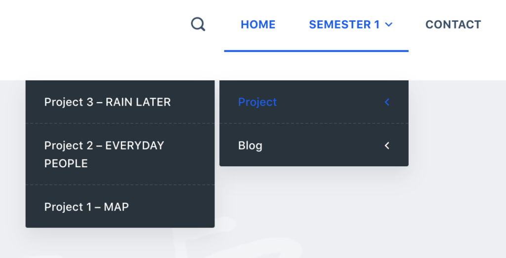
- The logical order of the navigation bar has been rearranged. Classified according to semester. There are two categories of projects and blogs in one semester. Among them, projects and blogs are ranked according to the time of publication, and the latest one is ranked highest. Make it more reasonable and clear.
- The different parts of each content have been relabeled and divided. Separating lines are used to distinguish the different stages in the progress of each project. Make the reading process clearer than before. Readers can feel the transformation of the project process more directly.

- Re-edited the tags for each piece of content. Divided by semester. Corresponds to the semester classification in the navigation bar. In the future content layout, clear labels also help me to classify content categories more quickly.

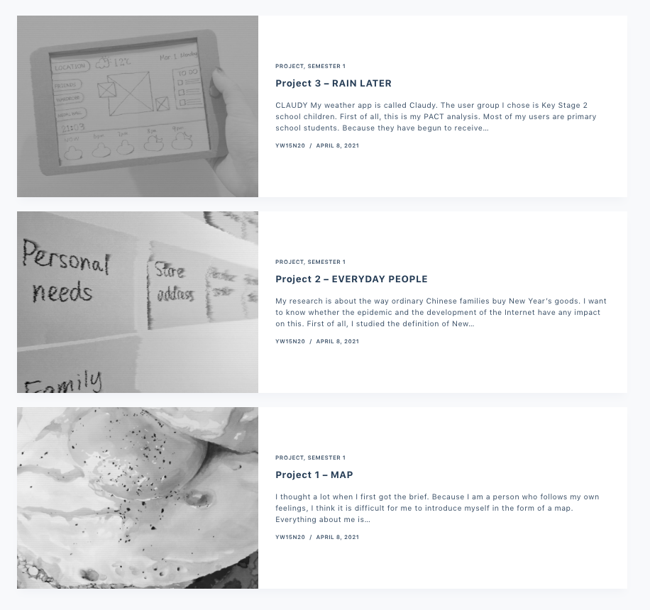
- There are separate settings for the featured pictures of each article. Makes the content of each article in the overall preview easier to quickly perceive. There is also a better distinction visually.
- For the longer text fragments in specific projects, keyword annotation and further refinement are carried out to reduce the burden of reading.

Thanks for reading! See you next blog!